Deep dive · JUN 2026
The work nobody notices: scoring 100 across the board
Headless WordPress, careful images, a hero video that ships with the code, and a lot of small fixes.
Joel Hart10 min read
Working at Be the Change Group gives me a rare kind of opportunity: I get to build meaningful products that impact people’s lives. Be the Change is a research firm and creative agency here in Vancouver, working with organizations in public health, education and climate. Earlier this year, I worked on a small marketing website for one of their campaigns, See Alcohol Differently.
The campaign ran during the FIFA World Cup, and it asked people to notice something that’s easy to miss: how much alcohol, and the advertising around it, influences us. Once you can see the influence, it gets easier to understand how it shapes what we do, and what it does to our health.
I’m really proud of the work I did on it. It’s the first website I’ve built that scored 100 in every Lighthouse category and passed Core Web Vitals. A campaign like this only works if people actually see it, on whatever phone and connection they have. So speed and accessibility weren’t polish. They were the point.
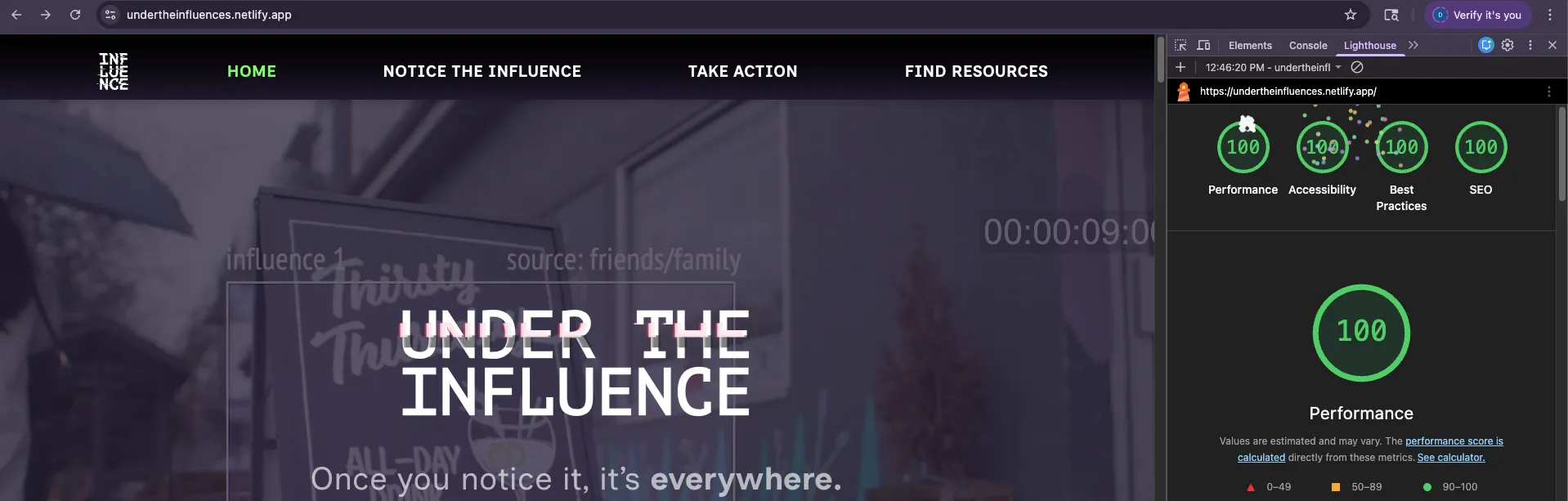
This is what we did, and why.
The playground time
I’d recently fallen for Sanity, and mostly for its content editing experience. Image cropping and hotspots are built in, you can shape the editor around exactly what people need, and the whole content model is written in code, right next to the front end that uses it. I wanted that for every project we take on.
A lot of our partners and clients know WordPress well, though, and that familiarity is worth a lot, so we stayed with it. What I was given instead was a bit of time, about two weeks before the real build started, to bring as much of that experience as I could to headless WordPress.
The first thing was publishing. We’d used Atlas, WP Engine’s hosting platform for headless WordPress, on earlier projects, and I realised we were paying extra for something we didn’t need. All it really had to do was notice when content changed and rebuild the site. So I wrote that myself: a small plugin that listens for pages being published or unpublished, pages being saved, and custom fields being saved, and calls Netlify’s build hook.
Editors click Update a lot, sometimes five times in a minute while they fiddle with a heading. So the webhook waits. It fires once, takes a lock, and if more saves come in during the wait, it schedules a single build at the end instead of five. On the Netlify side, a short script skips the build entirely when nothing that affects the site has changed. The WordPress theme lives in the same repo, and I didn’t want a PHP tweak to redeploy the front end.
The second thing was the content model, and it’s where Sanity’s influence shows most. I wrote the custom fields in code instead of clicking them together in the admin. Every field group is defined in the theme, so the structure lives next to the components that use it. That matters more than it sounds. Content editors need things to change quickly: a new section, a field that should’ve been two fields, a layout that isn’t working. When the model is code, changing it is an edit and a deploy, and everyone can see what changed. Editors get a tidy set of fields that match the page, and we can reshape them in an afternoon.
The third thing was images, which turned out to be the biggest win of the whole build.
Images: making sure they don’t f*** performance
Editors upload whatever they have. A 4000px photo straight off a camera, into a slot that’s 350px wide on a phone. If the front end just takes the original URL and drops it into an <img>, you’ve lost before you’ve started. The browser downloads far more image than it needs, which slows down Largest Contentful Paint. And it doesn’t know how tall the image is until it arrives, so the page jumps, which is Cumulative Layout Shift.
So we split the job in two.
WordPress stores a small, deliberate set of sizes. Every upload gets cut into these when it’s uploaded:
// Keep the image-size system intentionally small. Astro controls layout and
// CSS handles object-fit, while WordPress only provides a few reusable source files.
add_image_size( 'hero-bg', 2400, 1400, false );
add_image_size( 'slider-landscape', 1440, 810, false );
add_image_size( 'influence-card', 752, 512, false );
add_image_size( 'circle-card', 700, 700, false );
add_image_size( 'partner-logo', 640, 320, false );
WordPress records the URL, width and height of every one of those files, and the GraphQL API hands all of it to the front end. That’s the bit I’d stress. The dimensions are data. The front end never has to guess or measure.
Then Astro renders each image with every available size in a srcset, plus a sizes attribute that says how wide that particular component is at different screen widths. A circle card says it’s 350px on bigger screens and up to 70% of the screen on phones. The slider says something different. A tiny icon just says 60px. Only the component knows how wide it really is, so the component writes that line.
The browser does the rest. It reads sizes, works out how many pixels it needs for this screen and its pixel density, and downloads the smallest file in the srcset that will still look sharp. A phone gets the small file. A big retina screen gets the big one. Nobody writes a media query in JavaScript.
Every image also gets its width and height, so the browser reserves the space before the file arrives and nothing jumps. Images load lazily, except the few at the top of the page, which load early and at high priority.
Editors can still override the size with an optional field. Its instructions basically say “please leave this alone”, because the default is almost always right.
The hero video ships with the code
The homepage opens on a full-screen background video. That’s about the riskiest thing you can put at the top of a page if you care about load speed.
The first version did what you’d expect from a CMS-driven site: the video was a field in WordPress, so editors could swap it. But this campaign was built around a video our team had made, and it was never going to change. Once I understood that, keeping it editable meant paying for a choice nobody needed. The video came from a second origin, it was the heaviest thing on the page, and there was nothing to show while it loaded.
So I took it out of the CMS. The video now ships with the site as a fixed asset with a long cache, the field that pointed at it is gone, and it has a poster image. The poster is an AVIF of 7,440 bytes and the video is about 8.2 MB (both measured as files on disk, not over the network). The browser paints the tiny poster almost straight away while the heavy video streams in behind it.
The poster is about 1,100 times smaller than the video
- Hero video (MP4)
- 8.2 MB
- Poster (AVIF)
- 7.4 KB
Both files get a year-long browser cache. If the video ever changes, it gets a new filename, and browsers fetch the new one.
One small thing: the plain loop attribute was re-rendering the video on every pass. So instead, when the video ends, a listener sets it back to the start and plays it again. It’s guarded so Astro’s page transitions don’t pile up duplicate listeners. The kind of detail that shows up as jank on a slower phone.
Fonts come from the build
The fonts are declared once in the Astro config. Astro’s Fonts API downloads them at build time and serves them from the site itself, and the layout preloads only the two Inclusive Sans weights that appear above the fold. We only load weights we actually use, because every weight is another file someone downloads.
The why is mostly about what’s not there. There’s no request to Google’s servers holding up the first paint, no extra connections to set up, and the font files get hashed names like everything else in the build, so they can be cached forever.
Styles and motion
Tailwind v4, compiled and minified by Astro at build time. The output is one small stylesheet with only the utilities the templates use. Nothing clever, and that’s the point.
The homepage has pinned, scroll-linked sections, and that’s where the care went. I worked out the heading choreography on its own throwaway route first, with nothing else on the page, and only then brought it into the real sections. Each section owns its own height, its own sticky wrapper and its own scroll-progress value, instead of sharing one big abstraction. Tailwind utilities come first, and custom CSS is only there for the animations that really need it.
That made the motion easier to reason about, and it made it lighter. Less CSS, fewer moving parts, and fewer places for a layout shift to hide.
Caching: decide it once, per kind of file
All the headers live in netlify.toml, next to everything else about the deploy. Once you think of the files as three groups, the rules write themselves:
| What | Cache-Control | Why |
|---|---|---|
HTML pages (/*) |
public, max-age=0, must-revalidate |
Content changes on every deploy. Always check. |
Build output (/_astro/*) |
public, max-age=31536000, immutable |
Filenames are content-hashed. If it changed, the URL changed. |
| Hero video and poster | public, max-age=31536000, must-revalidate |
Big, rarely changes, not hashed, so rename to bust. |
Favicons and the few hand-placed SVGs check every time, because their names aren’t hashed and a stale icon stuck in someone’s browser for a year is a silly bug to have.
There’s caching at build time too. Every page needs the menu, the footer and the survey settings. Without care, every page in the build asks WordPress for the same three things. Instead, the first page to ask starts the request and every other page waits on that same one. Faster builds, and less load on WordPress.
Accessibility: Lighthouse reports aren’t enough
The other thing I’m proud of is how much I learned about accessibility on this project. A 100 in Lighthouse’s accessibility category matters, but it only covers what a machine can check, and it misses a lot of what actually affects the people we want using the site. So I also ran axe DevTools over every page, and then did the unglamorous part: I put the mouse away and went through the whole site with a keyboard.
That’s where the real fixes came from. Dialogs close on Escape, and when one opens it announces itself with the right labels. There’s a “Skip to content” link as the first thing on every page. The custom cursor, a little circle that follows the mouse, switches itself off and hands back the normal cursor as soon as someone uses the keyboard, on touch screens, and when reduced motion is on.
Reduced motion got real attention too. The text that reveals as you scroll is fully visible when animations are off. Otherwise people who’ve asked for less motion could end up with invisible text, which is worse than no animation at all. And the pinned sections don’t pin at all under reduced motion, so the page just scrolls like a page.
What I’d do again on day one
Put image dimensions in the API before writing a single component; in a headless build, image performance is a content-model problem first. Serve fonts from the build from the start. Be suspicious of anything big that comes from the CMS just because it could, and ship it with the code if nobody will edit it. Write the caching rules with the first deploy, while the list of files is still short. And keep a throwaway route around for hard animations, because working out motion inside a full page is miserable.
Scoring 100 across the board is something I’m really proud of. It won’t always be easy, or even possible, on every site I work on. But the lessons from this one will help me make careful decisions on the next, and build products and websites that work for the people who use them. Nobody visiting the site will ever notice this work, and that’s how it should be. At the end of the day, the score is about taking the time to care about the people who use what we build.